Wednesday, June 29, 2011

New Design: Elyse & Josh's Hometown Wedding Invitation


When Elyse and Josh approached me about designing their wedding invitations a few things were very clear from the start: they wanted invitations that clearly expressed who they were as a couple, they had a modern, organic and playful sense of style, and they were not afraid to experiment with printing and color. We played around with multiple design options and finally settled on a "hometown" themed invitation that showcased (through blind impression) the beautiful rivers and lakes of Rochester, NY. Elyse and Josh both cherish time outdoors – hiking, biking and camping, which made this design a perfect fit.


Response Card


With matching envelopes


Elyse & Josh's monogram

The design consisted of a deep, earthy green that matched both the outer and RSVP envelope. We also created a custom compass rose monogram that Elyse plans to use throughout the wedding. The final invitation suite was printed by Letterpress Chicago who did a fantastic job with the detailed blind impression map.

Tuesday, June 28, 2011

Intrigued and Inspired By: Montreal's New Tourism Campaign


These crazy creatures have been on my radar for the past month or so. I keep spotting them both in print and online. I was instantly hooked by their curious presence (What are they?) and by the beautiful illustration quality (Can we say yes to color and line?). Reid forwarded me the above ad from the New Yorker this morning, and I decided it was time to start digging. This group of hybrid animals are the voice of Montreal's tourism campaign. It is hard to find out much about them–which is an utter shame. In my opinion, these guys could be a huge success. Why you ask? They are quirky and visually stimulating. They have distinct personalities that are witty and humorous. And, they are WAY out of the box for current advertising trends.
Bearcan: not to be read beercan, but half bear and half toucan

Deerus: Half Walrus Half Deer

Squirrog: Half Squirrel Half Frog


The Ceagle Brothers: Half Eagle Half Cat

I just adore them all. We are actually headed to Montreal with Reid's parents for a weekend vacation, and I might stalk these ads all over town. I am hoping they are easier to find in Montreal. Until I find out more, does anyone know what agency or illustrator is behind this? I want to give them the credit they deserve.

Monday, June 27, 2011

Starting a Vintage Sign Letter Collection...

via

I am finally going to stop talking about how much I love old sign letters, and I am going to do something about it. I am starting a collection - today (or tomorrow after you help me make my first purchase decision). This collection is going to be legendary (at least for me). Old letters make me so happy.


In 2005, I tried to start my collection with a beautiful 2 foot plastic "A" (seen here in my first Chicago Apartment) that I bought at Standard Deluxe during the Old 280 Boogie Woogie in Waverly, Alabama. It was quite a conversation piece in every place I lived. Since it was such a treasured find and my first authentic vintage sign letter, I always placed it in a prominent spot for all to see. People, especially my husband, didn't understand why I had a giant "A" as decoration. They just didn't get it. I bought an "A" because it is one of my favorite typographic forms. I guess an "L" or a "C" would have needed less explanation, but they are boring letterforms. Sadly my "Waverly A" was knocked off of a shelf by Russell, the cat, about a year ago. I was devastated.


Which brings me to today...
I am going to start my new collection with an obvious letterform, "B". Since I got married, I finally have a great typographic form that doesn't require explanation. Today, I started researching old sign letters, and I found a great place to buy them online called Bay City Cargo. I am also swooning over Kidimo (pictured above). They are a Parisian boutique specializing in found letters. They are out of my price range, but their studio and letter pieces are amazingly inspirational.

I need your help with my "B".

My two favorites from Bay City Cargo are below. Which one do you like? Leave a comment and let me know. I am buying one of the two tomorrow depending on which one gets the most votes.

Option #1: Red See-through Plastic (17 inches tall)

Option #2: Worn Plastic (17 inches tall)

Also, if anyone has any flea markets or antique stores that have sign letters please let me know. Thanks!!!

Friday, June 24, 2011

Type Inspiration

Happy Friday! The weather is weird again in Chicago, but I am still very excited about the upcoming weekend. Why, you ask? Because I am going to be lazy... do a little work, clean up a bit and relax. I can't wait.

To end the week, I wanted to share a couple of extremely inspirational typographic images that I have been hoarding lately over on pinterest. I hope you enjoy!


This one pretty much speaks for itself. It is and incredibly beautiful combination of type, antique wood and color.


I am also slightly obsessed with this one. It is hand drawn and each mark and scribble has a life of its own. STUNNING!


I am intrigued by this G. I love the mathematical precision mixed with a little unexpected and organic flare.

Wednesday, June 22, 2011

Tickets to Spain (check)


After a lot of back and forth on destination, searching for flight deals and figuring out the amount of time I could take off work, we finally booked two tickets to Madrid for Reid's Bar Trip. For all the non-lawyers out there, myself included, this is a trip to celebrate the completion of the Bar Exam and is also the final big vacation before starting the "real world" at a law firm with LONG hours and unexpected last minute deadlines. I am so excited to travel to Spain as it has been a dream destination ever since my parents went to Barcelona for the 1992 Olympics. The Spanish culture, art and design has always been a huge inspiration to me, and I cannot wait to see it all in person.

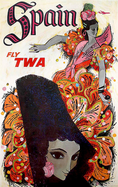
Both posters are from David Klein's famous TWA poster series created in 1960. I really appreciate and respect most of his illustration work, but his travel posters are among my absolute favorites. These colorful illustrations capture the beauty of Spanish culture through the movement and fashion of matadors and flamenco dancers. I simply don't agree with bull fighting at all so we will not be attending one, but matadors do have a very strong historical presence. On the other hand, flamenco dancing is breathtaking and I do want to check seeing the "real thing" off of my to-do list. Klein captures the over-the-top elegance of both outfits beautifully. Also, the color combinations used combined with the extreme spacial relationship of the figures are what make them memorable piece of design history. Are the typefaces cliche? Totally, but I like the kitschy Spanish vibe.

Does anyone have any Spanish recommendations for our trip?


Tuesday, June 21, 2011

New Design: Save the Dates for both Melissa and Liz

Awhile ago, two friends of mine from different walks of life (childhood and Atlanta during grad school) approached me about designing their wedding stationery. I was thrilled beyond words because both Liz and Melissa were fantastic girls with elegant style. Plus they were my first two weddings to design outside of Chicago.


Melissa and Marc wanted a simple but elegant save the date that showed their zest for life and extreme love for one another. Their engagement photos were spectacular and we couldn't decide on just one feature photo. So we played up the photographs and went minimal on the type. The back of the card simply mimics the design on the front and gives the guest a bit more information. Melissa's invitations are also stunning. I get to pick them up in a couple of days and cannot wait to see the final outcome. 


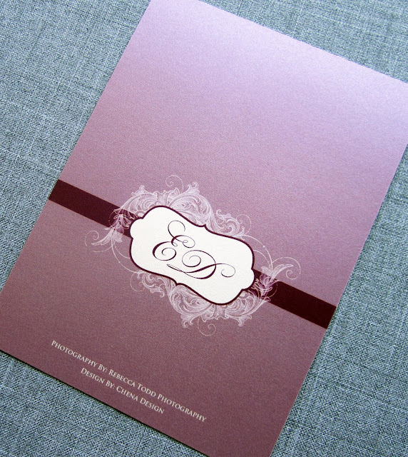
Liz and Darren wanted a Save the Date that set the tone for their "old world elegance" wedding in Houston, Texas this fall. Liz knew what she wanted: scroll work, elegant typefaces and eggplant purple. We played around with multiple options, but decided on the regal design seen below. Another childhood friend, Becky of Rebecca Todd Photography, took their stunning engagement photos and was also in charge of printing them on a beautiful pearlized/sparkly photo paper (sorry for the glare on the photo). Liz's Save the Dates definitely set the tone for everything else to come. Her invitations are going to be out of this world elegant.


Monday, June 20, 2011

Time Flies...


When you are married to your best friend.

Sorry for the bit of cheese in the title, but it's truly how I feel! Yesterday marked our 1 year anniversary. It is hard to believe that a year ago we go married in the humidity and heat of the Georgia mountains. The first year of marriage has had a lot of ups, very few downs and a LOT of learning experiences. All in all, I am still the happiest girl in the world...

Especially since Reid surprised me with a trip to Graham Elliot last night for dinner. I have been wanting to go there for a very long time and was completely shocked when he pulled up to the door. We even got a tour of the kitchen. Reid knows that one of the keys to my heart is through good food and great ambiance.

I cannot wait to see what this year brings for us.

(oh and sorry for not posting for the past few days - our Internet has been in and out. It is finally fixed and I have a lot to share this week)

Wednesday, June 15, 2011

Dreaming of Glass Door Knobs...


via

For as long as I can remember, I have loved glass door knobs. I admit it is quite odd to have loved such a strange item since I was a little girl, but it is true none-the-less. I blame my mother and her parents (Mama and Papa) for my obscure love of vintage hardware. Since we put the offer on our house, I have decided that I want glass door knobs on all of our doors. And, I don't want the new but made to look old knobs, I want the real thing. So, I have started my hunt on ebay for the perfect authentic door knobs. Do you know of any good places to find squeaky old knobs?

I love this red door. Maybe I should paint our interior doors???

Someday I would love glass knobs in the kitchen too.


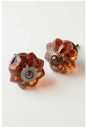
Anthropologie always has good knobs. These would look beautiful if I can't find the real thing...

Tuesday, June 14, 2011

Inspiration Overload: Abigail Brown's Handmade Creatures

 
Today, while taking a quick creative break, I stumbled upon Abigail Brown's beautiful, handmade creations. I was instantly blown away by the incredible, tactile quality of each bird and her immense attention to detail. She creates each one with found and bought fabrics both old and new. I am dying to own one of her animals. Hopefully one day I will. If you have time make sure to check out all of Abigail's work on etsy and her website.


Friday, June 10, 2011

Happy Friday!


Our "home" went under contract earlier today!!! I am SO excited and just hope all goes well with the inspection and appraisal. Then we can close and the home will officially be ours.

Ahhhh...

"Home Sweet Home," well, not really but almost...

I feel like I am on top of the world right now, just like this amazing super hero dachshund. What an amazing photo, right? It made me laugh on this busy Friday afternoon.

Hope you all have a very happy weekend.

Thursday, June 9, 2011

New Design: Asha's Monogram & Letterpress Stationery


Asha approached me right after the New Year about designing a custom monogram for a set of nice personal stationery. She wanted the design to be sophisticated enough to send to work colleagues and business connections, but also whimsical enough for everyday friendly snail-mail. She nailed down the monogram design very quickly, but it took awhile to decide on color and layout for the final stationery. In the end, Asha chose a beautiful blue letterpress design (printed by Boxcar Press) that is both classy and playful, and the liner adds so much depth. I know I would be very excited to get a note from Asha in the mail, but maybe I am biased?!?

Wednesday, June 8, 2011

House to Home...

via
via

I think I have mentioned it before, but Reid and I are in the full on search for our first home. I have read everywhere that it is an intense and stressful process, but, even with the warning, I was expecting it to be a breeze. I truly love looking at homes and interior spaces, so how hard could it be, right?

Now I can speak from experience (as minimal as it may be), it is tough. We fortunately have an AMAZING realtor who is caring, funny and listens to our crazy concerns. We have seen a little bit of everything, and I have fallen in love with a couple of places, have been side-swept by crazy amenities in others (steam shower anyone?) and have been slightly disappointed with how boring some are.

So, as of yesterday, we put in our first offer. EEEEKKKK!!! I am so anxious, and am trying desperately not to get my hopes up until the deal is sealed. Amidst all of my analyzing of things to fix, dreaming of new furniture and scoping out the hot new paint colors, I am trying to remind myself what a "home" is. It doesn't really matter what it looks like. What matters is how you live in it and the memories you make. Deep in my heart, I know that home is what you make of it.

I will keep you posted on the process, I promise :)

Monday, June 6, 2011

New Design: Elena & Tom's Chicago Wedding


Last Friday, our good friends Elena and Tom tied the knot in a beautiful ceremony at the Chicago Cultural Center, one of my favorite architectural spots in the Windy City. I was thrilled to be a part of such an incredible ceremony and event. It was very obvious that the new Mr. and Mrs. Gorman are full of love for each other and are surrounded by amazing friends and family.

About eight months ago, Tom approached me about designing their wedding stationery. He has a passion for letterpress and typography, and wanted the design to express that passion through their wedding invitations. We mixed traditional with edgy to create their look in both color and font to mimic the couples energetic and contemporary style. Their monogram is a playful and modern twist on the original logo of the Chicago Public Library, which was located in the Cultural Center until 1991. We had a lot of fun designing and tweaking the entire suite which included the save the date (posted here), invitation, reply card, outer envelope with custom liner, mailing label, programs, save the dates and day-of signage.

Elena and Tom's monogram is loosely based off of the original Chicago Public Library logo.

Invitation and Envelope with liner and label


programs


Wedding direction sign

Friday, June 3, 2011

Judging a Book by it's Cover: Vaclav & Lena


Last weekend while walking through  our neighborhood Barne's and Noble, escaping the torrential downpour in Chicago for a long city block, I was stopped dead in my tracks by the beautiful new book, Vaclav & Lena. I have a very bad habit of judging books by their covers, and this one is the best I have seen in a LONG time. The overall cool color palette is captivating with a modern edge. Even though the colors are beautiful they seem a bit dissonant. After reading the synopsis the minimal colors seem to be a visual clue to the interesting and sometimes sad plot. As much as I love the muted palette, the hand cut ampersand and type were the design elements that fully engage my attention. The type and flourishes bleed in and out of each other establishing the close bond between the main characters of the book. Not to mention, I am a huge fan of birds even if they are cliche right now. It is quite refreshing to find an illustrator stepping away from the digital world to create beautiful and unique designs. I did a quick Internet search to find the designer/illustrator but struck out. Does anyone know who designed this? They deserve MAJOR credit and I am sorry I cannot currently provide it.

Vaclav & Lena, by first time novelist Haley Tanner, has been reviewed quite favorably by the New York Times. As soon as I finish my huge stack of current books, I will definitely be read this one!

Have a great weekend!

Wednesday, June 1, 2011

Found Monogram Inspiration

It feels so good to be back blogging (just had to say that)!

As many of you know, I am an avid admirer of typography (pardon the alliteration there), especially when it deals with vintage and handmade lettering. My absolute favorite thing to both find as inspiration and to draw are monograms. Over the past few weeks I have been working on a few new monogram designs. When I work with a client on a custom monogram it is supremely important to me that I really get a feel for who they are and what they are looking for. Not only to I jump into my sketch book with very sharp pencils and giant erasers, I also scour the Internet looking for any historic monogram or vintage lettering that speaks to me. One of my current clients sent me a beautiful example from an old embroidery book as her starting inspiration. Eventually she wants to get her custom monogram embroidered into sheets, pillows, etc, which is so exciting for me because it means I am moving out of the paper only realm. While researching her monogram, I stumbled across these beautiful samples. Can we say inspiration overload!!! Hope you enjoy them as much as I do. They were truly inspiring for my first round sketches.


This monogram is stunning, and completely done by hand!


These are from an old book that a fellow blogger found. I am so jealous of it!