Thursday, June 9, 2011

New Design: Asha's Monogram & Letterpress Stationery


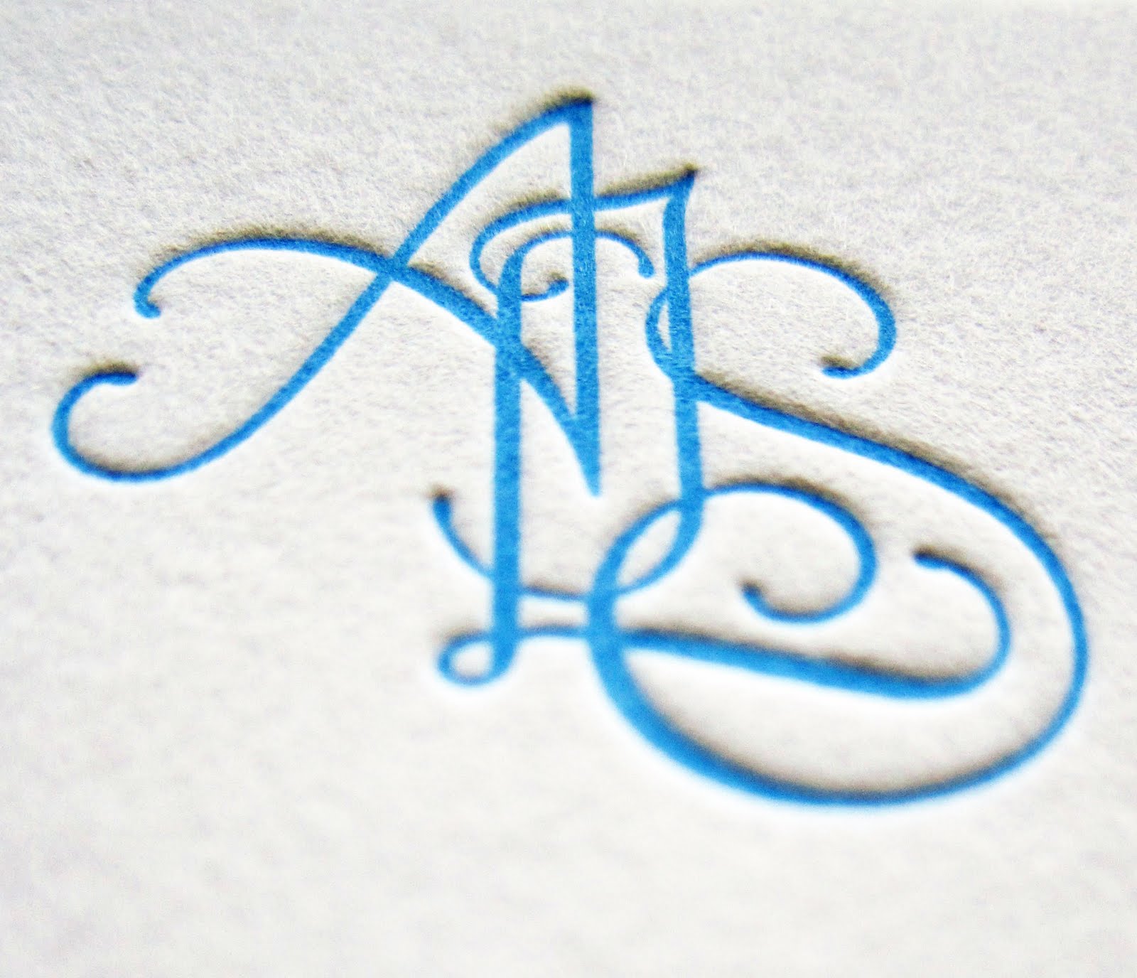
Asha approached me right after the New Year about designing a custom monogram for a set of nice personal stationery. She wanted the design to be sophisticated enough to send to work colleagues and business connections, but also whimsical enough for everyday friendly snail-mail. She nailed down the monogram design very quickly, but it took awhile to decide on color and layout for the final stationery. In the end, Asha chose a beautiful blue letterpress design (printed by Boxcar Press) that is both classy and playful, and the liner adds so much depth. I know I would be very excited to get a note from Asha in the mail, but maybe I am biased?!?

Wednesday, June 8, 2011

House to Home...

via
via

I think I have mentioned it before, but Reid and I are in the full on search for our first home. I have read everywhere that it is an intense and stressful process, but, even with the warning, I was expecting it to be a breeze. I truly love looking at homes and interior spaces, so how hard could it be, right?

Now I can speak from experience (as minimal as it may be), it is tough. We fortunately have an AMAZING realtor who is caring, funny and listens to our crazy concerns. We have seen a little bit of everything, and I have fallen in love with a couple of places, have been side-swept by crazy amenities in others (steam shower anyone?) and have been slightly disappointed with how boring some are.

So, as of yesterday, we put in our first offer. EEEEKKKK!!! I am so anxious, and am trying desperately not to get my hopes up until the deal is sealed. Amidst all of my analyzing of things to fix, dreaming of new furniture and scoping out the hot new paint colors, I am trying to remind myself what a "home" is. It doesn't really matter what it looks like. What matters is how you live in it and the memories you make. Deep in my heart, I know that home is what you make of it.

I will keep you posted on the process, I promise :)

Monday, June 6, 2011

New Design: Elena & Tom's Chicago Wedding


Last Friday, our good friends Elena and Tom tied the knot in a beautiful ceremony at the Chicago Cultural Center, one of my favorite architectural spots in the Windy City. I was thrilled to be a part of such an incredible ceremony and event. It was very obvious that the new Mr. and Mrs. Gorman are full of love for each other and are surrounded by amazing friends and family.

About eight months ago, Tom approached me about designing their wedding stationery. He has a passion for letterpress and typography, and wanted the design to express that passion through their wedding invitations. We mixed traditional with edgy to create their look in both color and font to mimic the couples energetic and contemporary style. Their monogram is a playful and modern twist on the original logo of the Chicago Public Library, which was located in the Cultural Center until 1991. We had a lot of fun designing and tweaking the entire suite which included the save the date (posted here), invitation, reply card, outer envelope with custom liner, mailing label, programs, save the dates and day-of signage.

Elena and Tom's monogram is loosely based off of the original Chicago Public Library logo.

Invitation and Envelope with liner and label


programs


Wedding direction sign

Friday, June 3, 2011

Judging a Book by it's Cover: Vaclav & Lena


Last weekend while walking through  our neighborhood Barne's and Noble, escaping the torrential downpour in Chicago for a long city block, I was stopped dead in my tracks by the beautiful new book, Vaclav & Lena. I have a very bad habit of judging books by their covers, and this one is the best I have seen in a LONG time. The overall cool color palette is captivating with a modern edge. Even though the colors are beautiful they seem a bit dissonant. After reading the synopsis the minimal colors seem to be a visual clue to the interesting and sometimes sad plot. As much as I love the muted palette, the hand cut ampersand and type were the design elements that fully engage my attention. The type and flourishes bleed in and out of each other establishing the close bond between the main characters of the book. Not to mention, I am a huge fan of birds even if they are cliche right now. It is quite refreshing to find an illustrator stepping away from the digital world to create beautiful and unique designs. I did a quick Internet search to find the designer/illustrator but struck out. Does anyone know who designed this? They deserve MAJOR credit and I am sorry I cannot currently provide it.

Vaclav & Lena, by first time novelist Haley Tanner, has been reviewed quite favorably by the New York Times. As soon as I finish my huge stack of current books, I will definitely be read this one!

Have a great weekend!

Wednesday, June 1, 2011

Found Monogram Inspiration

It feels so good to be back blogging (just had to say that)!

As many of you know, I am an avid admirer of typography (pardon the alliteration there), especially when it deals with vintage and handmade lettering. My absolute favorite thing to both find as inspiration and to draw are monograms. Over the past few weeks I have been working on a few new monogram designs. When I work with a client on a custom monogram it is supremely important to me that I really get a feel for who they are and what they are looking for. Not only to I jump into my sketch book with very sharp pencils and giant erasers, I also scour the Internet looking for any historic monogram or vintage lettering that speaks to me. One of my current clients sent me a beautiful example from an old embroidery book as her starting inspiration. Eventually she wants to get her custom monogram embroidered into sheets, pillows, etc, which is so exciting for me because it means I am moving out of the paper only realm. While researching her monogram, I stumbled across these beautiful samples. Can we say inspiration overload!!! Hope you enjoy them as much as I do. They were truly inspiring for my first round sketches.


This monogram is stunning, and completely done by hand!


These are from an old book that a fellow blogger found. I am so jealous of it!

Tuesday, May 31, 2011

Back at It: A Sneak Peak into Carla & Rich's Wedding Weekend

Reid and I bought wood and painted the direction signs by hand.

After taking a little bit longer than expected break from the blog, I am back at it today. As I mentioned, I needed to take some time to dive head first into freelancing full-time. The past couple of weeks have been a complete whirlwind, but I am absolutely loving every minute of it. Even after the short period of time, I know I made the right decision.

Last week, was filled with last minute design details for Carla and Rich's wedding. I have previously shown their Save the Dates and Invitation Suite, but I also did all the paper for both the Welcome Dinner and the Wedding Ceremony and Reception. On Sunday evening, after torrential downpour all weekend, the skies finally cleared to allow for an absolutely stunning wedding on the lake.

Carla will always go down in history as my first "official" client. She came to me right after my wedding to see if I would design hers. It was a HUGE undertaking (I actually think I designed more for her big day than I did for my own), but it was totally worth it. It also showed me all the different things I can design for future brides. Being a wedding stationery designer is so rewarding! I was able to work with Carla through every step and, hopefully, I made her day exactly what she expected. Carla was a blast to work with and I am so happy for Rich and her.

I will be posted a lot more about their wedding in the near future (I want to get professional photos also), but I wanted to give you a sneak peak into the weekend...


Above is the invitation for Carla & Rich's Welcome Dinner. I made a custom pattern based off of a fabric Carla had sent me. She wanted the party to have an subtle American theme since it was Memorial Day weekend. In the end, the softball game had to be canceled due to weather, but it was still a fun event with delicious BBQ and great people. I designed the water bottle labels below as well!


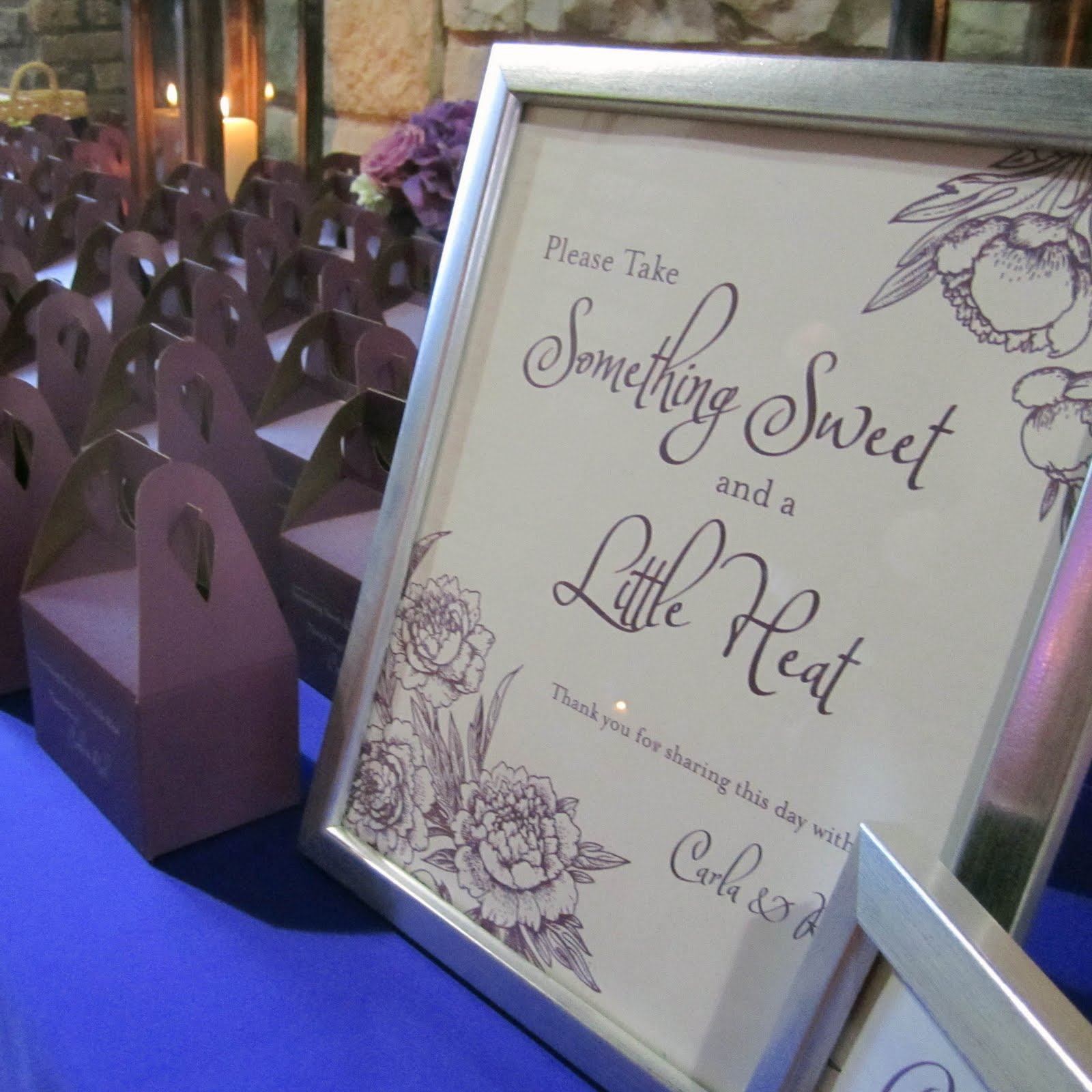
I designed all the signs for the wedding also. The above sign is for her favors. More pictures are coming soon and I am so excited to share them with you!

Tuesday, May 17, 2011

A New Chapter


Yesterday was officially my last day of teaching (at least for the foreseeable future). I resigned a few months ago to focus on my steadily grown freelance design, illustration and stationery company Chena Design. And so today, I began the new chapter in my life as a full-time designer.

I woke up this morning with very mixed emotions. Don't get me wrong, I am very excited about my transition into full-time freelance. The past couple of months have been a whirlwind trying to balance teaching and design. But I am also going to miss the classroom, my fellow instructors and, mostly, my wonderful students. Over the past two and a half years I have been so inspired by the creativity and passion of my students. I cannot wait to see what each of them does in the future. Above are a couple of pictures from one of my favorite teaching memories, our field trip last summer to Hamilton Wood Type Museum in Wisconsin.

I may take a small break (no more than a week) from the blog to fully transition into my new lifestyle.  I cannot believe I am actually freelancing full-time!!! It has been a dream for quite some time. Stay tuned for lots of new and exciting things.