Thursday, October 3, 2013

Pink is in the Air...


It is October which is Breast Cancer Awareness month, so pink is everywhere. It is always fun to witness the abundance of pink especially in a big city like Chicago. Sears Tower (aka Willis Tower, if we are being proper) is even lit up in pink for the month! It is amazing. So, to stay on theme, I thought I would show you Annie and Chris' classic with a twist invitation.

Annie wanted a very simple and classic invitation for her formal nuptials. However, she really wanted something on the invitation to have a neon pink "pop". A little bit of flare. Her wedding was going to be all black and white, except for her cakes which were going to be a rainbow of neon colors. Can we say AMAZING!!!

In the end we created a traditional letterpress invitation on bright white paper with black ink. And to get in the pink, we painted the edges. The edges are bright and bold, but it is a design element that doesn't overpower the entire suite. I just LOVE the spunky twist on a classic invitation.

Enjoy!


Thursday, September 12, 2013

It's Time to Get Serious: Website Inspiration and New Logo...

Ten Little Bluebirds homepage. Yes, the little nougat is my precious girl (I couldn't resist).

I am beyond thrilled to share my go-to photographer, creative collaborator and good friend, Emily Cummings updated website and blog, Ten Little Bluebirds. Long story short, I met Emily about two years ago at a bridal shower that we both attended, a few days later I fell in love with the shower photos she posted on facebook, so I asked her to take my headshots (that sounds so fancy and formal) for Chena Design, and from there we established a lasting friendship and creative partnership. Emily and I bonded over owning a small, creative business, and constantly throw our dreams, crazy ideas and future goals back and forth.


Needless to say, I was THRILLED when she asked me to help redesign her photography company. She wanted a new fresh look that was delicate, organic and modern, and could be used across all her audiences. Her photography speaks for itself, so I didn't want the logo to distract from her images. In the end, we created a simple typeset logo with custom illustration and watercolor details. I love the way the logo turned out, and am even more impressed with Emily's new website and blog (which she did herself!)

Her site is so inspiring! Hopefully it is just the inspiration I need to finalize my new site.

And, stay on the lookout for more fun and exciting collaborations between Emily and me! Coming soon...

watermark logo

Thursday, August 22, 2013

Tiffiny & Parris' Fun and Shimmery Invitation Suite

The belly band added so much "flare" to the suite!
So, I am keeping my promise of posting more frequently. (I just hope a few people are still reading these little posts every now and then)

I am thrilled to finally show you Tiffiny and Parris' fun and shimmery, spring wedding suite.

Tiffiny came to me with a very clear vision of the overall aesthetic and feel she wanted her wedding day to portray: formal but not stuffy. She knew her exact colors, the flowers she wanted and had a good idea of how the venue would look on her BIG night. The only thing she hadn't nailed down in her head (and on her pinterest boards) was the look of her invitations. She did know, however, that she wanted her suite to be shimmery, and that she wanted to print with letterpress. I knew from the second we met that this would be a good design match. I was so motivated by all of her ideas and inspirations, and jumped right into the design. I even had a new metallic paper that could handle letterpress and I was dying to use it.

I started the design process with a custom three letter monogram that she not only used on her invitation suite, but also throughout her day-of paper. We printed her elegant but fun suite on Reich's Odeon shimmer paper with deep purple and charcoal letterpress. I am not exaggerating when I say that "this paper prints beautifully!" It was the first time I had printed on it, and the results where like the perfect dream. At the last minute we added the shimmery orange belly band. Tiffiny wanted all three of her colors in the invitation package and with the belly band we made it happen. It also adds a fun and colorful element of surprise when the guests open the envelope.

I hope you enjoy and I can't wait to show you the another new project next week...

Custom 3 Letter Monogram
The Odeon paper is simply breathtaking...
The full suite. The invitation is 2 Color letterpress while the other pieces are 1 color each. 

Thursday, August 8, 2013

Life Changes and a Little Thanks...

Man, it has been way to long since I have been on here. I must admit life has been a little, who am I kidding, a LOT busy lately. Reid and I welcomed a beautiful baby girl into the world at the end of March, and it has been a full-speed ahead, whirlwind since then. What can I say, life has changed. All for the better of course. But, while I was adjusting to motherhood and keeping up with my work for the company, Chena Design, the blog got left in the dust – completely. My extreme apologies and I hope to be back to regularly posting soon because I have SO many new invitations, monograms, announcements and many other things to share with you.

Before I leave you for today, I want to thank you all for staying with us during the hiatus by showing you the hand lettered Thank You notes I created for my daughter, the love of my life. I drew the letters towards the end of my pregnancy and then digitally printed them on thick, cotton paper. I love the play on words with "mini" standing in place of "many." I hope you enjoy.

Until next time (which will hopefully be VERY soon),
Lindsay


Thursday, February 14, 2013

Natalie and Dan's Elegant Houston Wedding

Some of you may remember Natalie's Save the Date that I posted about last year. Well, I finally had time to photograph her elegant wedding suite with the time and devotion it deserved. 

Natalie and Dan were such a pleasure to work with. Not only were they fun and kind; they also had a very specific look in mind for their big day which required a lot of creative brainstorming and fun design elements. They really wanted an invitation suite that mimicked the formal elegance of the cathedral where they got married, but was also completely unique to them as a couple. In the end, we pulled out all the stops: gold foil, custom liners, blind printed embellishments, edge painting, etc. I know I am slightly biased, but I think the end result is stunning! I hope you enjoy.


The wedding invitation with the custom liner printed on metallic paper.


This image doesn't do the full suite justice: you miss all the blind printed scroll detail, but I do love the simple elegance of each piece. 


A close-up of the gold foil monograms and the embellishments.


I really loved the details on the wedding detail card.


The full suite was held together with a simple gold belly band.


Natalie and Dan's custom monogram helped tie all the pieces together throughout the wedding. It was used throughout the suite, on the Save the Dates, on her Rehearsal Dinner invitations and all of her Day-of Wedding Paper. Hopefully they will continue to use it in their married life.


A close up of the blind printed embellishments.


The final touch of gold edge painting helped add another bit of shimmer and elegance. 

Tuesday, January 15, 2013

Laura & Andy's Chicago Inspired Wedding

Many of you know how much I love my adopted home of Chicago, so when Laura and Andy approached me about designing a modern Chicago invitation suite for their summer wedding I was beyond thrilled. This invitation design was an absolute blast to work on. Mainly because Laura was an incredible and gracious client who knew what she wanted but was open to my creative inspiration. Plus, I was able to explore, manipulate and finesse Chicago photography (both new and old) so it would be letterpress ready. We printed all the pieces of her suite on thick cotton paper in charcoal gray letterpress. The details of the photography turned out beautifully and helped set the tone for their city wedding. I hope you enjoy!


The main invitation was pretty classic in style and look, so we added a modern custom liner to jazz it up a bit. 


Each piece in the suite focused on a different Chicago view: the skyline, Navy Pier and the famous Chicago Theater. 


The details in the Chicago Theater Sign really shined with letterpress printing.


I absolutely adored working through typography on this invitation. Can we say, "fun!"


We also did digitally printed rehearsal dinner invitations and day-of designs that coordinated with the letterpress invitation suite.


The simple program was the final design touch before the amazing couple became "Mr. & Mrs."


Monday, January 7, 2013

Classic Elegance: Brooke & Adriel's Wedding Suite

Brooke and Adriel tied the knot in a beautiful and fun wedding in San Diego last May. Can you believe that I was working on these invitations last year at this time? I am SO behind in posting new work, and hope (that with the help of my new camera) I will get everything up for the world to see in the next month or so. 

Back to the invitations at hand...

Brooke and Adriel wanted a simple and sleek invitation that combined classic elegance that wasn't stuffy at all with their fun and carefree outlook on life. You may remember their save the dates from awhile ago. They both appreciate good design and tiny details, which made the process incredibly fun. We tried some new things, kept some things traditional, and had a lot of fun along the way. I hope you enjoy!


The invitation is very traditional and printed with black letterpress and a gold foil custom monogram on extra thick cotton paper.


In order to add a bit more elegance (and to mimic Brooke's incredible dress and veil), we designed a lace vellum overlay with a black grosgrain ribbon as a belly band. 


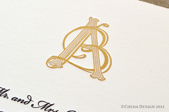
A close-up of their custom monogram.


Brooke and Adriel did an online RSVP, so the insert for their wedding suite was an invitation to their Lime, a traditional Trinidadian celebration. The Lime was going to be a joyous, social and celebratory occasion for all the guests and the invite needed to mimic the party. We printed the invite on a bright purple paper with a matte gold foil. It coordinated with the invitation, but definitely encompassed its own personality.


The Lime invitation added a modern and playful flair to the formal suite. 


 The final touch to the invitation was a shimmery black liner that helped tie everything together.