Tuesday, January 15, 2013

Laura & Andy's Chicago Inspired Wedding

Many of you know how much I love my adopted home of Chicago, so when Laura and Andy approached me about designing a modern Chicago invitation suite for their summer wedding I was beyond thrilled. This invitation design was an absolute blast to work on. Mainly because Laura was an incredible and gracious client who knew what she wanted but was open to my creative inspiration. Plus, I was able to explore, manipulate and finesse Chicago photography (both new and old) so it would be letterpress ready. We printed all the pieces of her suite on thick cotton paper in charcoal gray letterpress. The details of the photography turned out beautifully and helped set the tone for their city wedding. I hope you enjoy!


The main invitation was pretty classic in style and look, so we added a modern custom liner to jazz it up a bit. 


Each piece in the suite focused on a different Chicago view: the skyline, Navy Pier and the famous Chicago Theater. 


The details in the Chicago Theater Sign really shined with letterpress printing.


I absolutely adored working through typography on this invitation. Can we say, "fun!"


We also did digitally printed rehearsal dinner invitations and day-of designs that coordinated with the letterpress invitation suite.


The simple program was the final design touch before the amazing couple became "Mr. & Mrs."


Monday, January 7, 2013

Classic Elegance: Brooke & Adriel's Wedding Suite

Brooke and Adriel tied the knot in a beautiful and fun wedding in San Diego last May. Can you believe that I was working on these invitations last year at this time? I am SO behind in posting new work, and hope (that with the help of my new camera) I will get everything up for the world to see in the next month or so. 

Back to the invitations at hand...

Brooke and Adriel wanted a simple and sleek invitation that combined classic elegance that wasn't stuffy at all with their fun and carefree outlook on life. You may remember their save the dates from awhile ago. They both appreciate good design and tiny details, which made the process incredibly fun. We tried some new things, kept some things traditional, and had a lot of fun along the way. I hope you enjoy!


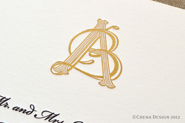
The invitation is very traditional and printed with black letterpress and a gold foil custom monogram on extra thick cotton paper.


In order to add a bit more elegance (and to mimic Brooke's incredible dress and veil), we designed a lace vellum overlay with a black grosgrain ribbon as a belly band. 


A close-up of their custom monogram.


Brooke and Adriel did an online RSVP, so the insert for their wedding suite was an invitation to their Lime, a traditional Trinidadian celebration. The Lime was going to be a joyous, social and celebratory occasion for all the guests and the invite needed to mimic the party. We printed the invite on a bright purple paper with a matte gold foil. It coordinated with the invitation, but definitely encompassed its own personality.


The Lime invitation added a modern and playful flair to the formal suite. 


 The final touch to the invitation was a shimmery black liner that helped tie everything together.