Thursday, July 28, 2011

Oh Canada!

The bar exam is OVER and today we head to Montreal for a little weekend get-a-way with Reid's family. I am super excited about this little adventure. I have never been to our neighboring Canada and am thrilled to explore a tiny portion of the beautiful and friendly country.

In order to jump-start the trip (did I mention I haven't packed yet and we leave in 1.5 hours), I wanted to share a couple of beautifully designed Canadian posters.


The moose on this 1950's poster by William F. Schey and Harry Rogers is a stunning combination of shape and color. The Australian airline did a great and quite extensive series of travel posters which you can see here.

Above is the Formula 1 poster for the Canadian Grand Prix this year. The movement and simple color mixed with the natural paper quality are incredible. I absolutely love when clients choose simple, visually strong design. All of the posters for the 2011 Formula 1 season are pretty incredible.

I am going to try to post tomorrow, but if you don't hear from me I will be back next week.

Wednesday, July 27, 2011

It's Almost Over...

Adorable poster available on etsy!

Today is the last day of the Illinois Bar Exam, which my hubby, Reid, is taking. I am so ready for it to be over. The Bar Exam and the many flash cards, books and papers that go hand and hand with it have been our constant companion for the past few months. This incredibly difficult test has been the third (well, fifth if you count the cats) member of our family, and quite frankly, I am ready to kick it to the curb.

In all seriousness, Reid has handled the pressures of studying with patience and grace. He has constantly surprised me with his devotion and diligence in learning all the legal topics from top to bottom. The past three months have consisted of hours upon hours of studying mixed with high levels of stress, and Reid has handled it like a super star. I know, without a doubt, I could/would not have done the same. I am so very proud of him and know he is going to be an awesome lawyer!

Now, come on 4:45pm CT... I am ready to celebrate the completion of this little exam :)

*Also, thanks to all our friends and family for their constant support during Reid's studying. We love you for it!!!

Monday, July 25, 2011

Random Found Monogram Inspiration

It's Monday and things have been busy, busy, busy. I am working on more monograms and perused the internet to get my creative juices flowing. I am always so inspired by what others are creating. Below are some of my favorites...


I love the simplicity and elegance of this logotype monogram for the band The AMs done by Thinkmake Studio


The hand-drawn quality here mixed with interacting letterforms and fantastic vintage inspired colors make this an easy favorite. I found it on pinterest.

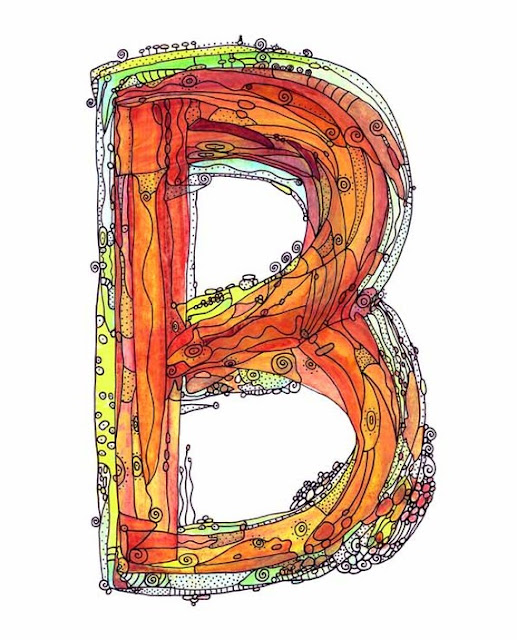
Can we say love at first sight? I am still drooling over this watercolor letter created by IngridsArt over on etsy. She has almost all the letters in the alphabet and each one is just as stunning as the last.

Friday, July 22, 2011

New Design: Monograms Galore

Over the past few months I have been doing a bunch of new monograms for wonderful clients who all had unique visions for their custom creation. In the past, most of my clients use their monograms for personal and/or wedding stationery, but lately a few clients have bigger plans for their monograms, including using them for embroidery, decorating and engraving. Below I wanted to share a few of the most recent designs. Hope you enjoy and Happy Weekend!


Liz wanted an elegantly modern one letter monogram to use on her wedding stationery. After we finalized the letter and printed the stationery, she kept finding new ways to use her monogram. Recently, we sent it to her lighting specialist so he can shine it on the dance floor during the reception. How cool is that???
One of my previous monogram clients bought her mother a monogram for Mother's Day. Great gift in my opinion. Mary Ann wanted something playful and feminine. Once we finished her monogram (above) she gave it to her mother to hand embroider. I cannot wait to see the end result that incorporated 3 generations of fabulous women. 
Annie's monogram is going to be used throughout her wedding stationery. It has a simple, classic charm that I adore. 

Julie's also wanted a monogram for her and her soon-to-be husband to use once they tie the knot. She had a very modern vision, and didn't want too many curves and flourishes. In the end we decided on a beautiful linear monogram with a graphic quality. 


*Please remember that all monograms are the property of Chena Design. Do not reproduce them unless it is to a personal blog and credit is given. 

Thursday, July 21, 2011

Inspired by: The Kennedy's

Over the past few days I have been absorbed in The Kennedy's miniseries. While it may not be award winning, it is very entertaining (Greg Kinnear is a very convincing JFK). I even feel like I am learning a bit about the JFK administration, which I knew little about beforehand. I completely understand why the Kennedy family fought to have it canceled on its prime time spot. It doesn't show the family, especially Ambassador Kennedy in a very good light. Through all the scandal and hardship of the Kennedy presidency one thing is for sure, Jackie Kennedy Onassis (even when played by Katie Holmes) has a fantastic sense of style. I am so inspired by her fashion and eloquence in front of the camera (even though she hated it in the beginning). The above pic from Life Magazine of her and JFK Jr is one of my all time favorites.

Wednesday, July 20, 2011

Loving Gray and Yellow

via

I absolutely adore the color yellow. I grew up with a bright yellow bedroom, and, for as long as I can remember, all my birthday and Christmas presents were yellow. I guess I made my love for the color very clear and therefor people only bought me yellow trinkets and treasures. Simply put yellow makes me happy.

As Reid and I plan our fast-approaching move into our first home, decorating continuously comes up in conversation. I do most of the talking during these conversations, and Reid thoughtfully listens and comments as needed on subjects such as affordable furniture, curtains and rugs. I have been dying to have a yellow room ever since we first spotted our now "under contract" house. It has a ton of natural light and yellow just seemed to fit the personality of the turn of the century abode. After very little convincing, Reid agreed to a yellow and gray living room. I am so EXCITED!!! The images of today's post are providing a lot of sunny inspiration.

BTW, since we are on the subject of yellow, did you know that yellow is the least popular favorite color? Sad, huh? These are the little facts that you discover when you teach Color Theory.

unkown source

via

via 

via 

via

Monday, July 18, 2011

Found Monogram: Merchandise Mart


I often overlook Chicago's largest architectural landmark, The Merchandise Mart. Its size alone is daunting. Have you ever tried to get from one corner to the other? I find it impossible. Because of how overwhelmed it makes me, I usually try to erase all thoughts of it from my mind. But, this past Saturday I leisurely walked by it on my way home, and because I wasn't trying to make it to a meeting, find a cup coffee, or catch a train, I was able to admire it's grand historical beauty. The Merchandise Mart is an incredible Art Deco building – not to mention that it has a simple, modern, and linear monogram as its original logo. Most of the monograms I do are inspired by ornate Victorian monograms that are filled with flourishes and details, so I find it very refreshing to see a minimal historic monogram. The Mart's monogram is all about lines and shape and their relationship to each other. Yes, it kind-of looks like a spider, but its fun and it fits the architecture and size of the building.

I can't wait to research more Art Deco monograms. Can anyone think of any on a building near you?


Thursday, July 14, 2011

Starting Up: Creating a Full-Time, Freelance Design Studio


I love my blog, I really do, but lately my life and design career have been changing (or, should I say, evolving) at a very rapid pace. I have had limited time to dedicate to Tailored and over the past few days, I have been thinking long and hard about the direction that I want my blog to take. I originally revived Tailored in order to document and write about my daily inspirations. In the process of doing that, I was able to establish the direction that I wanted my career to take. It was a slow process, but through writing, researching, and searching the internet for my posts, I realized that (1) I loved working for myself, (2) I was crazy about doing hand-drawn typography, (3) I was still very passionate about design, and (4) I cherished working with amazing individuals (not huge companies). So, I took a HUGE plunge and decided to take a break from teaching to see if I could really make it as a full-time freelancer. I am a one-woman shop (for now) and every day brings new challenges. 

Which brings me back to the point of this post. My business is growing, slowly but surely. I am learning a LOT in the process. And, honestly, I am a bit stressed and nervous about all the little details of running a successful freelance business. So I decided that I needed a place to share these new parts of my artistic development every once in a while. I want my "Starting Up" posts to focus more on how I am evolving as a business owner/freelancer. I hope that they help my personal growth as a self-employed individual, that they spark dialog between other creative people going through similar career changes, and that the inspire others to think about doing what they are passionate about. These posts will be personal, full of stress, and hopefully we can all laugh at my successes and failures along the way. Of course, I've still got a lot of design inspiration to share. That's the amazing part about this new career – it is both the most challenging and most artistically inspiring thing I have ever done.


Full-time freelance is like what I imagine training for a marathon would be like.
 It is hard work but every day I feel like I am getting better and better at it. And with that said, back to work!


*BTW - The amazing poster from above is by the very-talented Brent Couchman (which reminds me - I should show more of his work). Found on Friends of Type, one of my favorite blogs!

Wednesday, July 13, 2011

Nostalgic for Home

I was in Houston for the past couple of days both for work and pleasure. Work trips are always better when you are able to stay with your parents and see all your siblings (plus I love the people I get to work with). It was a wonderful trip filled with good food, shopping with my mom, bike riding with my dad, a good ol' Texas party (for my brother and sis-in-law who are moving to the Windy City) and meeting with a few of my wonderful clients! All-in-all it made me a little nostalgic for Texas, the place I call "home. As silly as it may be, I am a Texas girl at heart and am darn proud of it.

In honor of my Texas pride, I found a couple of adorable Texas-themed designs to share with you...

Absolutely gorgeous! Poppy and Pinecone have almost every state on their etsy shop. 


Yellow + Type + Texas + Affordable = I might have to buy this. By Parada Creations


I love the hand-drawn type here. By Mandipidy


Tuesday, July 12, 2011

New Design: The Turquoise Pear Etsy Shop

My super awesome and very talented cousin, Amy, recently decided to open up an etsy shop to showcase her fabulous baby and children's gifts. Amy is very crafty, and is great with a sewing machine, but when it came to her logo and store banner she called me for help. I was thrilled to be a small part of her new shop. Amy had a pretty good idea of what she wanted the design to look like (feminine, image of a pear, modern), so after a couple of quick rounds we were all set.  It was fun to work with Amy on this project, and I wish her all the best in this new online adventure. Each of her precious gifts showcase her talent and incredible sense of style. I know the store will be a success and I know exactly where I will buy my next baby shower gift.

Make sure you check out her store!

Friday, July 8, 2011

New Design: Jill & Riley's Vineyard Wedding


I met Jill and Riley on a chilly Chicago afternoon and was instantly warmed by their sincere and friendly personalities. Within seconds of meeting them, I knew they were going to be a very fun couple to work with. They are getting married at a beautiful Sonoma Vineyard in August, and wanted their invitations to reflect the natural elements of the destination and their casual, fun-loving personalities. They both have a love for the outdoors – biking in particular – and are getting married in wine country, so it seemed fitting that we outfit their whole stationery suite with a tandem bicycle filled with wine. I ended up illustrating the bike with pen and ink to give it a hand-made, natural vibe. Jill and Riley's thermography wedding invitation suite, thank you notes and rehearsal invites turned out beautifully.

Jill and I have a lot more up our sleeve for the actual wedding, plus Riley's mom is throwing a big Ohio shin-dig for all the guests that can't travel to the actual ceremony. I will have to show you those at a later date, but I can hardly wait...


The invitation with the custom liner and wrap around label. The liner really helped pull everything together into a cohesive bunch.


I love the labels. They set the mood for the entire package inside. 


Thermography is quickly becoming a favorite of mine.


Close up of the bicycle. We struggled to find an antique illustration that we liked so drawing it was the best option. Jill plans to use the bike on all sorts of goodies. 

 
The rehearsal dinner invite continued to play off of the same theme. It is simple but the big orange heart gives a fun pop of color. The natural envelopes help set it apart from everything else.

Hope you enjoy! Have a fabulous weekend.

Wednesday, July 6, 2011

Remembering a Master: Cy Twombly

 Untitled 1972

Camino Real (II), 2010

The Rose (II), 2008

One of my favorite artists, Cy Twombly,  passed away yesterday after a long battle with cancer. Since being introduced to Twombly's work as a freshman in college,  I have always been inspired by his energetic lines, purposeful colors, dominating scale and scribbly handwriting in his work. Today while looking at his online gallery and website, I was overcome with emotion. His work is striking on so many levels, especially when seen in person. I am so grateful that the Art Institute of Chicago had a Twombly exhibit last year that featured some of his most current works. He truly is a master of line and movement. Twombly will never be replaced and his work has forever changed the art world. I am grateful for him as an artist, and the freedom and inspiration found within his brushstrokes. 

Above are a couple of my favorites from his online gallery. All images copyright the artist.

Tuesday, July 5, 2011

Inspiration Overload: Lumadessa Prints

I am over-the-moon-in-love with these prints from Lumadessa, the boutique print shop of artist and designer Josh Brill. How have I not seen these until today??? They are remarkable. I am trying to come up with the perfect words to describe them, but fear that I may fall short so I will keep it simple – the shape, the color, the positive and negative space are all sublime. I think I need one, but which one???

Friday, July 1, 2011

Happy Fourth: Celebrating America!

I am on a bit of a travel poster kick right now. My current craving for a vacation is a little insane. There are a couple of trips planned in my near future, but I wish that time would travel a little faster. The beautiful posters below were created around 1937 for the WPA to promote American tourism. They have always been some of my favorites – the top one with the horse actually started my obsession of Montana which I still need to visit. The beautiful colors and simple shapes are almost as stunning as the actual American landscapes. There is so much out there to see. What are your favorite American destinations? Some of mine include Maine, Sedona, and Santa Fe.

Happy Long Weekend! July Fourth always makes me happy – maybe it is the friends, the bbq, the fireworks, or it may just be that I am proud to be American. We aren't perfect by any means, but this is my home and I am proud of it. 


images via