Monday, January 31, 2011

Dreaming of Lettered Jewelry...


I watched the season of Millionaire Matchmaker this weekend (it is a horrible guilty pleasure, I admit). During the show Patti was wearing this crazy, chunky gold necklace that spelled out HAHAHA. On her it seemed a bit young, but I couldn't get over its graphic and typographic nature. Simply put, I want it and instantly became mildly obsessed with finding it. After way too much time searching, I still couldn't find anything about the necklace or its designer, but I did find the same necklace (seen above) on Emma Stone from her October Nylon cover. It is pretty awesome and so is she. Does anyone out there know where to find it???

I didn't want to end the post on an unattainable note, so below are a few pieces of typographic jewelry that I have been obsessing over.

I have been in love with this necklace by Isette since last year at Renegade. I just need to bite the bullet and buy it.

World Charm's "This is a Necklace" necklace is so witty and beautifully designed.

Max and Chloe's monogram jewelry is elegant, sophisticated and classic. While I was growing up my mom had a small monogrammed necklace just like this. I loved it as a little girl and I still love the look today. Maybe someday I will add this to my collection.

Friday, January 28, 2011

Business Cards are In!!!


It's official, the rebranding of my freelance company is really happening, and happening pretty quickly!

I picked up my new professional business cards yesterday from Gary at Letterpress Chicago. They turned out exactly how I envisioned them – the bold red/orange color is perfect and the quality of letterpress is superb! Thanks to Gary (and his crew) for such speedy turn-around and spectacular quality.

For any of my readers that have started your own company, I have a whole new level of admiration and respect for you after going through the process. At times it is a little overwhelming figuring out all the business details, especially since I don't consider myself to be super business savvy. However, all the little things are really starting to come together, and I have started to see the light at the end of the tunnel. The business card helps since I now have something tactile to show for all the work that I have put into this new endeavor.

Next up, the website. Stay tuned...

Thursday, January 27, 2011

Tour of Coffee: Seattle Style

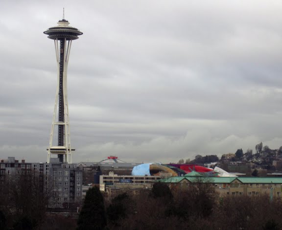
Last Friday was our first full day in Seattle and Reid decided that we were going to do a tour of coffee in order to see all the great neighborhoods. This "tour" was an incredibly sweet gesture by my husband considering that he absolutely despises coffee. On the other hand, I LOVE coffee--I drink it quite often. It keeps my creative juices flowing, and sometimes helps me get over the random creative-block that comes my way. Needless to say, when I woke up on Friday I was thrilled about the day to come, especially when I looked out our hotel window and could see the space needle! Sure, it was gray and rainy, but at least it was warmer than Chicago. I tried to take pictures of each of our stops to catalog our journey:

7:30am – Stop #1 – Top Pot Doughnuts – Downtown Seattle
Top Pot is my absolute favorite place in Seattle. I am normally not a huge doughnut fan, but these are spectacular. My mouth starts watering just thinking about them. It was a great way to start the day and to start the trip. Plus, I love the old neon sign outside the door. It's a classic. The funny part is that the sign has a bucking bronco on it!? I am not sure why that is the logo, but it is quite distinctive.

Approximately 8:30am – Stop #2 – 15th Ave Coffee – Capitol Hill
So at the second stop we were still drinking coffee with the best of them, but I was beginning to feel overly jittery from all the caffeine (did I mention that I had a cup of coffee at the hotel right when I woke up?). 15th Ave Coffee and Tea has a great visual vibe. It is dark, filled with folk style decorations (e.g. book pages on the wall and a laundry pin lamp--yes, you read that right--a laundry pin chandelier). It instantly felt homey, kinda like a mom and pop shop. Except, we soon found out, that it was owned and operated by Starbucks. Delicious coffee nonetheless. After about 30 minutes of enjoying the place, we headed down the street...

9am-ish – Stop #3 – Victrola – Capital Hill
Now completely hopped up on caffeine, we walked down the block to Victrola. The most inspiring part of Victrola was the awesome neon sign, and 1950s style lawn chairs. Nobody was sitting outside because it was raining, but I bet it is a really neat spot to hang out on a warm spring morning. When we walked inside it was packed, and so I decided I needed a quick break from coffee. Instead of drinking more 'joe we went for a walk and toured the neighborhood.

11am – Stop #4 – Solstice – University District
After our brief hiatus from coffee and a nice drive through some residential areas, we stopped at Solstice, a popular and trendy coffee shop/bar near the University of Washington. This place made a great latte, but you could tell it would be a great place to study at night with a cold brew next to you and your books because they serve beer if you don't want coffee! It was also super trendy in a college kind of way. I was really drawn to the huge lime green wall with the black paper cut outs on it.

1pm – Stop #4– Theo – Fremont
Solstice had such a great feeling about it and was hands-down the best cup of coffee I had all morning, so we decided that it should be our last official stop on the tour. There were about 8 more coffee shops on our list, but they will have to wait until next time. We drove away from U-District craving food that would help counter balance our caffeine high. In Fremont we grabbed a quick salad and a beer at Brouwers, a cool Belgian bar, then stopped by Theo Chocolate Factory to do a fee chocolate tasting (yeah for more caffeine) and then did a little window shopping. The chili-chocolate was my favorite. Reid liked the coconut curry chocolate.

All in all our tour was a great way to see the neighborhoods of Seattle, gave Reid and me some good, quality time together that we normally take for granted, and made me realize that there is a limit to how much coffee I can drink.


Tuesday, January 25, 2011

A Walk in the Park & Random Inspiration


This past Saturday we woke up to a glorious and sunny morning, which I am learning is quite rare during a Seattle winter, and decided we needed to take full advantage of the weather. So we met up with some good friends to grab brunch in Madrona (an adorable and quaint neighborhood near downtown) and then headed to Seward Park for a brisk stroll. While walking, talking and taking in the beautiful Northwest landscape, we came upon this random pile of burlap coffee bags. I was instantly struck by the color, texture and typography of the sacks. It was obvious that they were going to be used for an upcoming landscape project at the park, and it took every ounce of my overly-guilty conscience not to take a few for myself. While convincing ourselves that stealing is wrong, I was able to snap a bunch of photos.


These bags are really beautiful. The photos don't do them enough justice. There is just something incredibly inspiring about their simplicity and organic quality.

Below are some very inspiring examples of how burlap coffee sacks can be used creatively for home decorating and fashion. If only I had been able to get my hands on a couple without feeling guilty.

This chair looks incredibly classy, but it could just be the large formal portrait. (photo via)


Such a nice touch to any nook with a lot of natural light. (photo via)

This one is from a coffee shop near Seattle. (photo via)

I love the informal and natural coffee sack upholstered on the formal Ottoman. (photo via)

This bag is awesome in so many ways. It feels very Seattle. (photo via)

Monday, January 24, 2011

Crafty Seattle Finds...

I'm back and apologize for the delay in posts lately. Reid and I went to Seattle for a long weekend getaway, and I am just getting back into the swing of daily life again. I planned to post from the West Coast on Thursday and Friday, but it turns out that we were too busy taking in everything Seattle to slow down for even a moment. Even though nothing made it to the world wide web over the weekend, I did document almost everything we did and saw. So, most of my posts this week will focus on the beautiful, creative and inspirational side of Seattle.

I haven't had a chance to upload my photos from the trip yet, so today I wanted to focus on Seattle designers and crafters (found on the web) that I am inspired by. There is something breathtakingly fresh and natural about a lot of creative work in Seattle.

I spotted Julie's eco-friendly and sustainable textiles on her Etsy shop, but soon navigated to her blog and website. Her work ethic and dedication to the environment is inspirational, not to mention that her work is literally "simply" stunning. I would love one of these dish towels!

I am kind of in love with this simple jersey top by Out of Line. The beautiful linear details seem so urban, but there is also something refreshing and natural about it.


I don't know much about this one except that it would be a fabulous print for Valentines Day, and it combines color, geometric shapes and typography together. Can be found right here on etsy.

These last examples are from Ello There print shop, and they are just too darn cute! I love the whimsical feel of both examples. I am very inspired by the illustration and hand lettering, but also by the cute couple that creates them.

Wednesday, January 19, 2011

Inspiration Overload: Jessica Hische


I have been a big, no HUGE, fan of Jessica Hische for a long, long time. Her work combines two of my favorite things, hand-drawn typography and elegant, playful illustration. While looking through her portfolio today, I am reminded again why I love her work: each design is uniquely beautiful, each word speaks on its own and each individual letter begins to tell a detailed and intricate story. I have so much respect and admiration for Hische's work. It is quite obvious that she is passionate about what she does, and her drive shines through each of her pieces. So, I wanted to share some of her work with you. Also be sure to check out her site, blog (with tons of great design inspiration) and store (she has some great stuff for sale)!!!


This is Jessica's font Buttermilk. I just moved it to the top of my font wish-list. Beautiful!


The above letters are from her Daily Drop Cap project. This daily project, combined with teaching Typography right now, has really inspired me to do more personal hand lettering just for fun. Check out the whole project here!

This one makes me swoon, and it's not because of Taylor Lautner.

Tuesday, January 18, 2011

My New Photo Backdrops & Our Wedding Stationery


Boy have I been busy, in a very good way. There hasn't been much time to relax or even take a deep breath lately, but – trust me – I am not complaining. I absolutely LOVE everything that is happening right now: my business is growing, I am working with amazing clients and I am teaching two classes that I adore. So, all in all, things couldn't get better.

Over the weekend, I worked on a few wedding stationery suites and ran some errands for my tiny but quickly growing studio. My number one goal for the weekend was to build an easy, affordable, professional and efficient photo backdrop for both my portfolio pieces and quick photo shoots for the blog. After doing some online research, I decided to head to the local fabric store. Let me tell you, that place was CROWDED on a Sunday afternoon. I bought two yards of textured fabric, one gray and one off white/tan, and then pulled them around basic white foam core. It didn't take much time, was incredibly cost effective and I am pretty happy with the end result. Now, all I have to do is figure out the best time of day to shoot with daylight in my apartment. I guess it doesn't help that it has been so gloomy in Chicago lately.

With the new backdrops, I finally did a quick photo shoot of our wedding stationery from last summer. I really love how the letterpressed monogram turned out. Rohner Letterpress printed the invitation suite and did an impeccable job. Our wedding identity color-scheme consisted of a golden sunflower yellow and a deep, almost gray, navy blue. For the overall invitation design, both Reid and I (and our parents) wanted something that felt traditional and classic, but also whimsical and modern. We achieved that through both the wording and the fonts we used (Filosofia and Aphrodite). Since we got married in the Smoky Mountains, it was very important to us that our colors, fonts and the entire design for the wedding reflected our location and the vibe of relaxed, mountain culture. I hope you enjoy the stationery as much as I do. I still get giddy looking at it, and wish I could relive that day all the time.

I will be photographing a bunch of old work in the next week or so, so I am sure you will see much, much more.

Friday, January 14, 2011

Inspiration Overload: Monogram Wedding Stationary


The lettering on this wedding stationary designed by Nedim Rahmanovic is absolutely stunning. I saw it this afternoon on Mint and was instantly blown away. I adore monograms especially creative, custom and hand drawn ones (see my post about our wedding monogram). This particular monogram (and additional RSVP lettering) has a very modern twist on a traditional concept. It is very inspirational indeed. Love it!

Happy Weekend.

Thursday, January 13, 2011

Introducing the New Chena Design Logotype...

I have been working for months on my new logotype, identity and webpage. It is slightly embarrassing when I think about how long it took me to actually decide on a visual representation for my brand. Branding and identity design is one of my favorite areas, and I can design successful logos for other clients in a design-flash. But when it came time to redesign my personal identity, I did circles for a very long time. And in true graphic design fashion, in the end I decided to go with my very first idea. So, without further ado, I am introducing the logotype for Chena Design, my freelance name and website...

The logo is based off of my signature. Through both color and lettering, I wanted it to feel fresh, personable and modern with a hint of tradition. Since it is based off of my handwritten signature, I didn't want it to be too typographically perfect but still wanted it to showcase my ability to hand-letter. Finally, the Chena logo attempts to be feminine, since my new main focus is stationery and wedding design, but not overly so to keep with my background of branding and illustration.

In the next month, I will be letterpressing my business cards and completely revamping my website (which is currently very outdated). I can't wait to show all of you the end result.

Wednesday, January 12, 2011

Amazing Handmade Vintage Necklaces!


It goes without saying that I am constantly inspired by all the creative things I see on a day to day basis, both in real life and on the web. I am even more inspired when I find something innovative and beautiful that one of my college friends is currently creating. A couple of weeks ago, while checking facebook, I stumbled upon Lucy Carter Finney's new jewelry line. Lucy was always super stylish back at Auburn, and now she is using her strong sense of fashion to create one-of-a-kind jewelry from vintage pieces. Each of her necklaces is so striking and would look great with pair of jeans or with a cocktail dress. I love the versatility, the originality, and the hint of southern glamour. I cannot wait to order one for myself.

Right now, Lucy is taking orders via her facebook page, but for those of you that live in the South you can stop by Frou Frou on Eighth in Opelika (seen in this post).


Tuesday, January 11, 2011

It's Great to be an AUBURN TIGER!!!


WAR EAGLE!!!!!!!

If you haven't heard by now, last night we (the Auburn Tigers) were named the 2011 NCAA National Football Champs. My excitement is overflowing from the win against Oregon. It was a great game and a battle to the end. I am completely inspired by the love, determination, and dedication of the Auburn team, the coaching staff, and, of course, the amazing fans!

We had some of our Chicago friends over to watch the game. They all came in their orange and blue, and cheered along side me. It was a fantastic night all around. Auburn holds a very special place in my heart. It is a truly unique place that I am proud to call my alma matter. I will cherish the memories from last night and being able to share them with good friends forever.

Toomer's Corner, a HUGE Auburn tradition, after last nights game.

Nick Fairley with the championship trophy. Photo by Todd Van Emst.

*all photos via Auburn University website and Auburn's flickr page